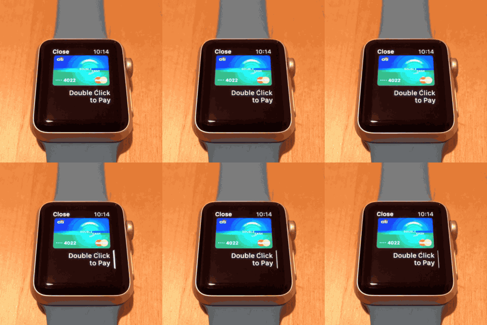
As I was exploring the built-in apps for the Apple Watch, I stumbled across this little gem of UI in the Passbook application, shown above. The animation is both delightful and beautiful, probably taking many hours to design and build, but ultimately fails its original purpose: explaining to the user how to use Apple Pay.
I’ve shown this screen to dozens of others, including designers and engineers, hoping to disprove my gut instinct on how useless this screen is. Unfortunately, I was correct. Nearly every single person I showed this to tried tapping the screen, the card, the text, or even that pulsing white rectangle. This is not to say that these people were foolish, but that this screen failed its purpose to inform.
When building an application, it’s important to reach out to new users and find out how effective each component actually is. If you have an idea for how users will react to a certain screen, make sure reality matches your vision. And hopefully with rapid prototyping, you’d be able to save a ton of time not building the wrong thing.
Life is too short to be spent building useless UI.
PS. For those still scratching their head on how to use Apple Pay on the Watch: double click the Contacts button the side to open the Apple Pay screen.